Sharing Map:
Mobile App for Sharing Things
This UX case study examines the development process of a free-sharing app designed to provide users with a seamless platform for exchanging goods and services at no cost, as well as discover local sustainable services and contribute to charitable causes.
Sharing Map is a community-centric eco-friendly platform for sharing items among users, promoting generosity and sustainability. User-friendly interface connects individuals who share items like books, clothing, and household goods, fostering a connected and caring community while minimizing waste and benefiting the environment
My role: UX / UI Designer
Project duration: May'23 - August'23
Problem
High Poverty Levels in Russia and CIS Countries: According to data from Rosstat, over 18 million Russians, or 12.7% of the entire population, live below the poverty line.
Food Waste in Landfills: According to the Higher School of Economics (VSHĖ) and Rosstat, around 17 million tons of food products end up in landfills each year. The amount of food wasted in landfills could feed 30 million people for a year – more than the number of Russians living below the poverty line. However, instead of this, 94% of the unused food products end up in solid waste landfills, polluting soil, water, and air, releasing toxins and carbon dioxide.
Textile Waste in Landfills: According to Greenpeace, the global fashion industry produces 100 billion units of clothing annually. The volume of waste from the fashion industry reaches 92 million tons. According to the United Nations, clothing production ranks second only to the oil and gas industry in terms of environmental pollution from waste. Every year, 85% of purchased clothing items end up in landfills.
Hypotheses
- Giving a thing to someone or providing help, I would like to know that it is owned by a reliable person, that it's in good hands and being used and not sold or thrown away.
- I would like to minimize the correspondence and give the item as soon as possible. I don't want to inform everyone in the end that the item is no longer avaliable.
- I need a convenient search and filters to find the needed item.
- It's easier to contact person directly in the messenger or on the phone and get immediate response.
- I need a possibility to book the item right away.
- I need a notification about new things of interest nearby.
- For quality control there should be a photo and detailed description. Reviews and rating can help me understand that a person is reliable.
User Research
Through in-depth interviews with 7 potential users, I gained insightful knowledge about their needs and pain points. Their stories have become my compass, guiding me toward crafting solutions that truly matter.
Interview Summary and Insights
I conducted in-depth interviews with 7 individuals from diverse backgrounds and locations. These interviews offered valuable insights into their unique experiences and perspectives. The participants included professionals, students, and artists from different cities. Through this diverse group, I aimed to uncover common themes and gain a comprehensive understanding of the challenges and opportunities they face, bridging both geographical and financial disparities.
- Users are motivated to extend the service life of things, save money, and care for the environment.
- Local communities and social organizations play a significant role in sharing and finding free items.
- Close relationships and helping people in need are important factors for users.
- Negative experiences with online platforms include poor communication, unreliable people, and spam.
- Selling items is often perceived as easier than giving them away for free.
- Users appreciate instant response, nice community, and safety in their sharing experiences.
- Users have concerns about the fate of donated items in charity shops and prefer supporting small local businesses.
- Users have a psychological need for a sense of purpose, progress, and social connection
Pain Points
- Lack of local organizations for sharing free items.
- Negative experiences with online platforms, including poor communication and unreliable users.
- Moderation issues and mixed experiences with the platforms they use.
- Difficulty in finding relevant and free items on social media groups.
- Concerns about wasted or lost items in charity shops.
- Difficulty in distinguishing between non-profit and for-profit organizations.
- Spam, doomscrolling, and irrelevant posts in local social media groups.
Competitor Analysis and Conclusions
I conducted a competitor analysis at the start of my research to generate more hypotheses and interview questions.
In the competitive landscape of sharing platforms, Olio stands out for its focus on reducing food waste and building community engagement. Freecycle provides a platform for sustainable exchanges, while Listia introduces a points-based system for trading items. Avito offers a broader marketplace, though with potential challenges related to language, safety, and item quality.
Existing sharing platforms showcase appealing attributes but also display limitations affecting user experience and accessibility. These include regional constraints, quality control, language barriers, and safety worries. By addressing these concerns, our platform emerges as an inclusive, reliable option, meeting the diverse needs of individuals seeking seamless, secure item sharing experiences.
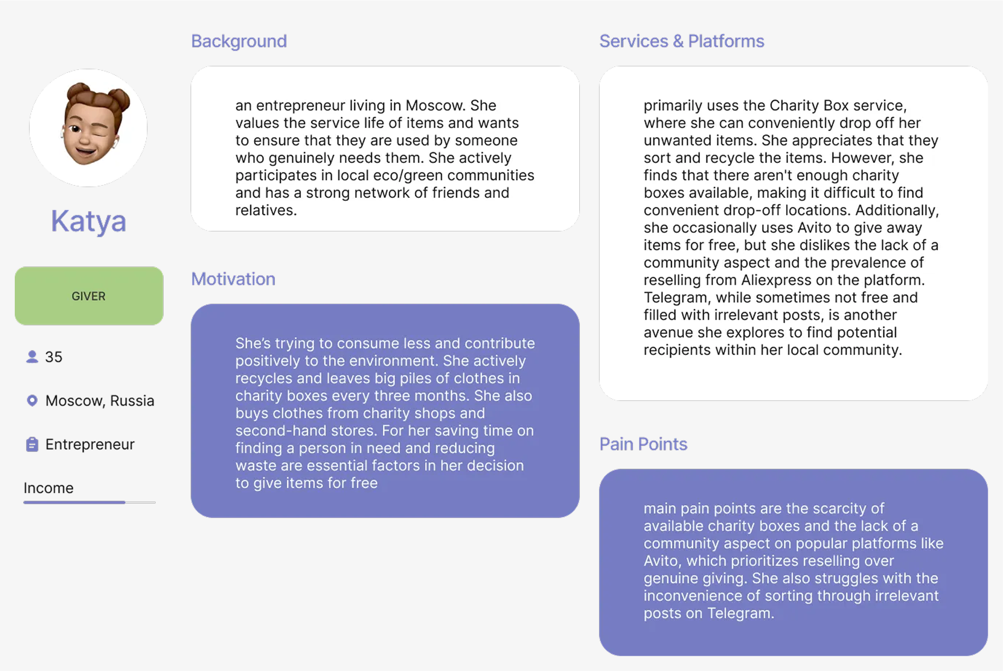
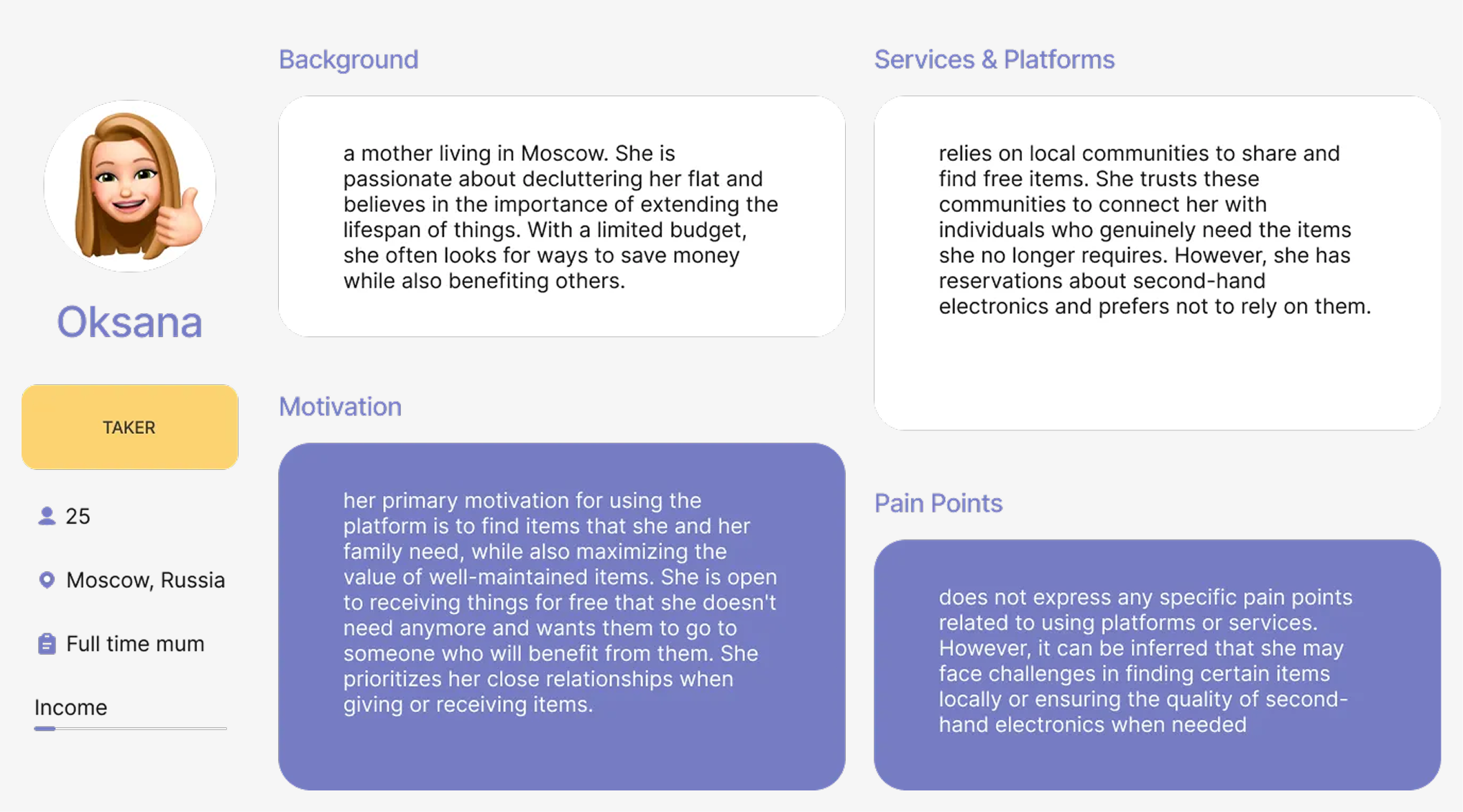
User Personas
Drawing from the results of in-depth interviews, I crafted two distinct personas, each offering a unique perspective. While these personas share common traits, such as a commitment to environmental consciousness and digital engagement, they differ in aspects such as income, location, and family status. This approach allows me to effectively target a specific audience segment initially, ensuring comprehensive coverage of their needs before expanding to a broader user base.
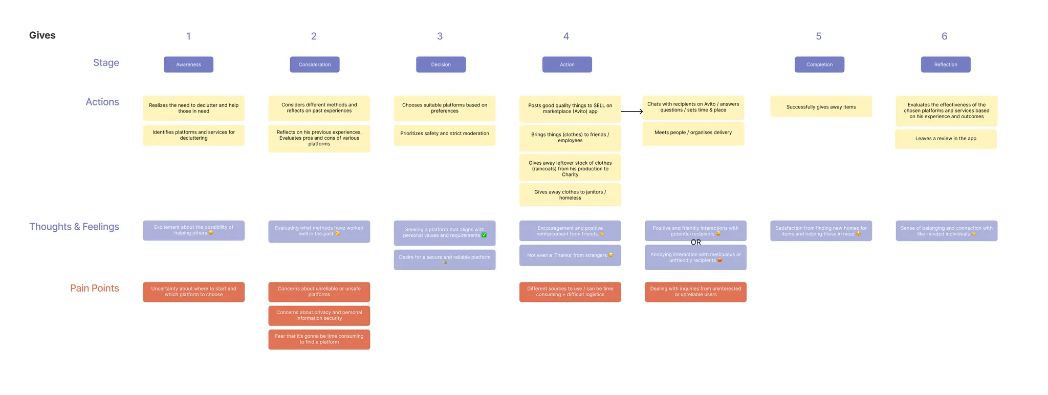
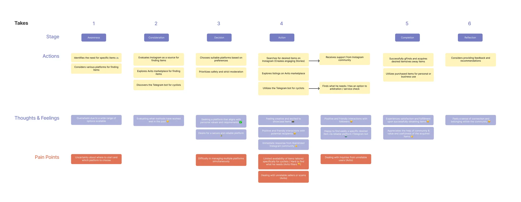
CJM
Given the challenge of accommodating diverse user pathways across various platforms to fulfill their needs, I developed two distinct CJMs—one catering to those offering items for free and another tailored to individuals seeking items. This approach allowed for a more precise analysis of user motivations and pain points, leading to more targeted and effective design solutions.
JTBD
| I want to… | When I… | So that I can… | Without… |
|---|---|---|---|
| I want to get rid of old things | When I declutter my grandma's house | So that I can help those in need | Without spending too much time organizing logistics of different services |
| I want to find free things for myself and my child | When I when moving houses | So that I can save some money | Without monitoring many different platforms |
| I want to get rid of unwanted and unused stuff fast | When I don't have a place to store | So that I can free some space | Without necessity to post 100500 listings |
| I want to give second life to my good quality things | When I I cannot use them anymore | So that I can contribute positively to the environment | Without weird interactions with strangers |
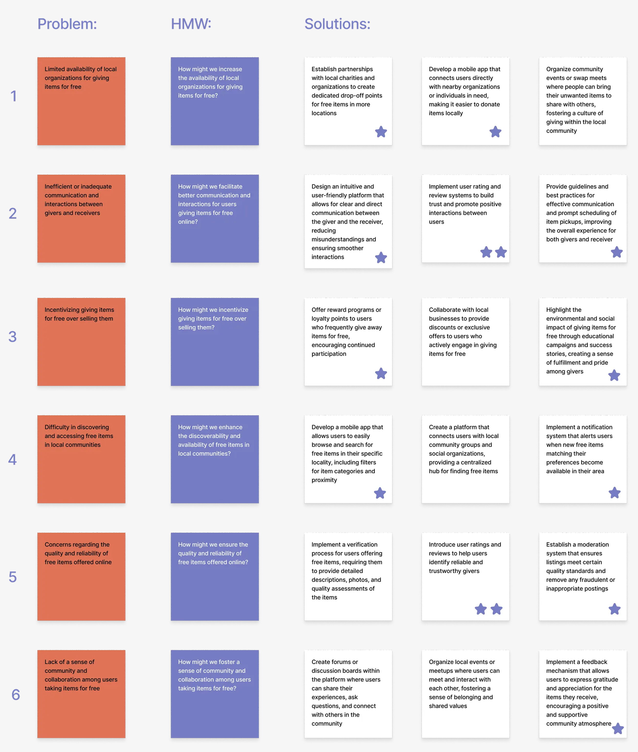
HMW
By employing this method, I generated several valuable ideas for the app. This approach involved crafting targeted questions, proposing different solutions for each challenge, and evaluating these options based on their utility and feasibility.
Information Architecture
Based on the research above and the, the arrangement of the existing sections has been restructured, and new sections have been organized:
- Main Page with Listings
- Listing Card
- User Profile
- Favourites
- Posting Listing
- Your Profile
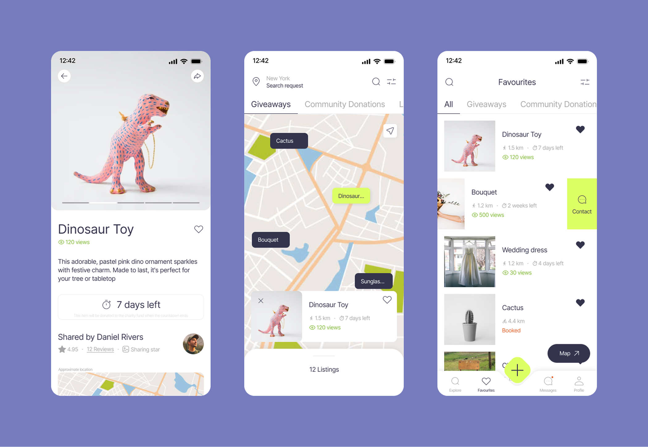
1. MAIN
After completing registration and onboarding the user is directed to the Main Page of the app that provides various listings sourced from its users. These listings can be customized to individual user requirements and preferences through the search filters and location settings, which are accessible through the map interface.
Moreover it incorporates a Community Donations section, featuring various funds and charity organizations along with details about their donation requests. Furthermore, there's a Local Services section encompassing a range of services aligned with recycling, conscious consumption, decluttering, and related themes. This holistic approach transforms the main page into a hub that caters not only to individual item sharing but also fosters community engagement, charitable contributions, and access to services promoting sustainable living.
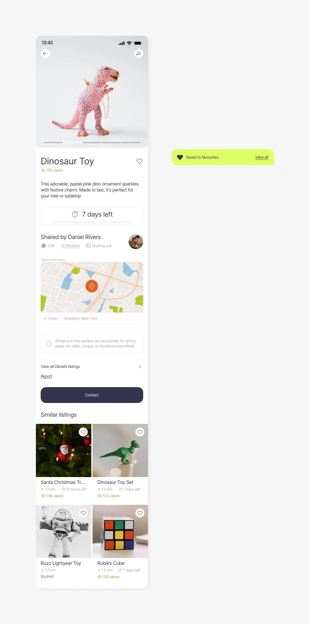
2. LISTING CARD
This section includes information about the listed item, presented alongside photo images, allowing user to gain a clear understanding of the offering. Additionally, you can access information regarding the user who owns the listing.
In addition this section also contains the number of views the listing has garnered, its location and proximity, and optionally, a countdown encouraging interested individuals to initiate quicker interactions with the user. Furthermore, users can explore all other listings by the same user and discover similar offerings suggested by the app's algorithm.
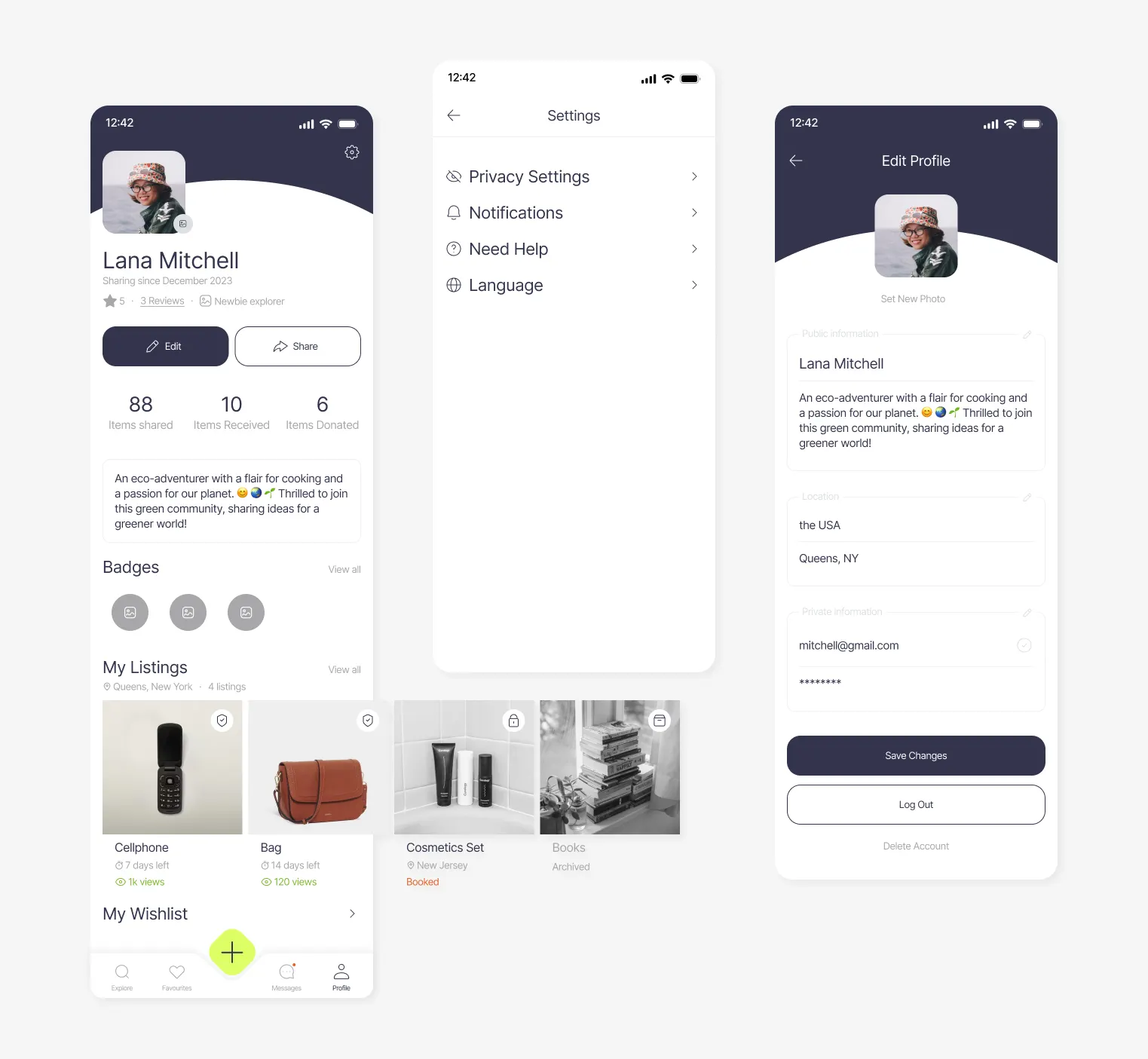
3. USER PROFILE
This section displays user name and photo (optional) along with a self-description or welcoming text. It also showcases achievements and badges earned through their interactions. The page also provides visibility to the user's active listings, rating, and reviews, creating a dynamic snapshot of their contributions and interactions within the platform.
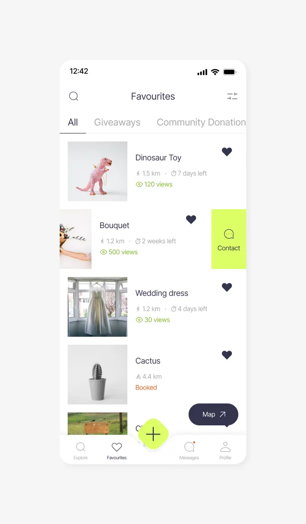
4. FAVOURITES
This section curates a collection of saved listings indicating their status (whether it's active, booked, or unavailable), offering the flexibility to effortlessly remove selections or directly communicate with the listing owner.
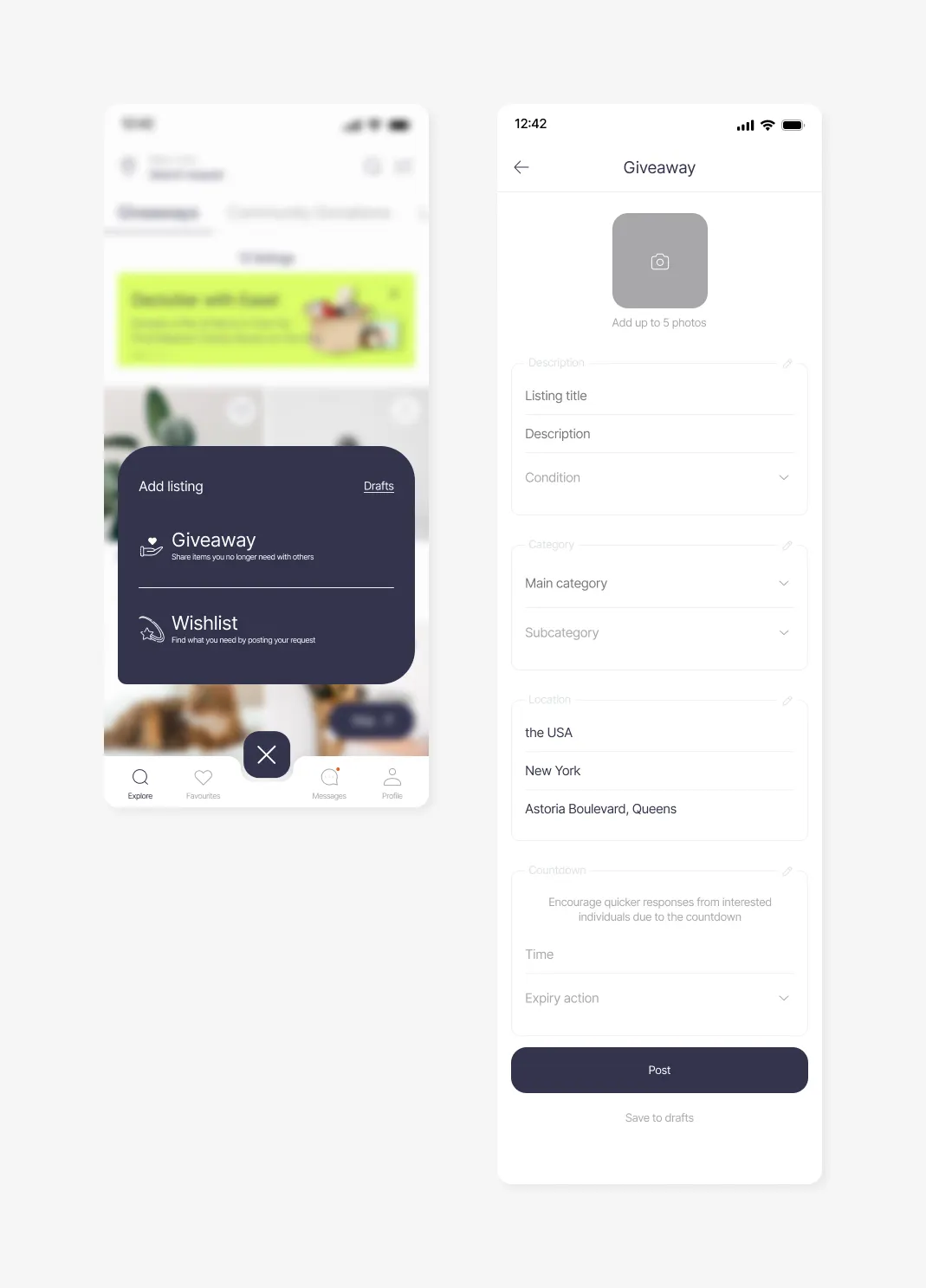
5. POSTING LISTING
Users choose between giving away or requesting items. They can access previously saved drafts and upload up to 5 photos for visual representation. Adding a title, description, and selecting condition options provides detailed information. Categories and subcategories of the item, and location adjustment ensures accuracy. An optional countdown feature adds urgency.
6. YOUR PROFILE
This section includes your name, an optional photo, and a personalized welcome message to introduce yourself to the platform's community. Access to settings and editing your information. Your achievements are highlighted, showcasing your interactions. Furthermore, your posted listings for giveaways and wishlist are displayed, offering a snapshot of your sharing activities.
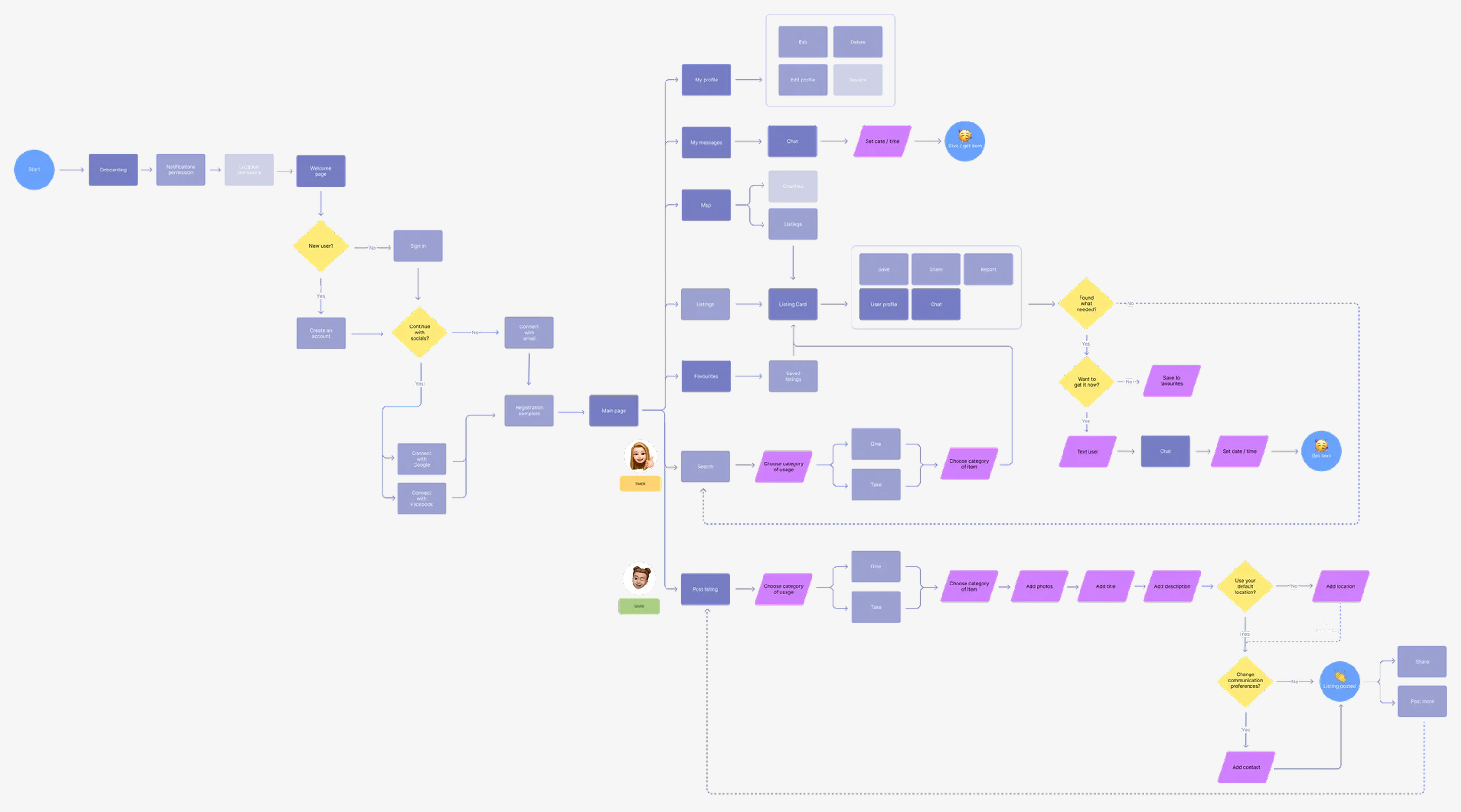
User Flow
By mapping out the sequence of actions and interactions that users would undertake within the app, I was able to identify potential bottlenecks and refine the navigation pathways. This approach not only facilitated a clear visualization of the user journey but also enabled me to anticipate user needs and preferences, ultimately leading to a more user-centric and efficient design.
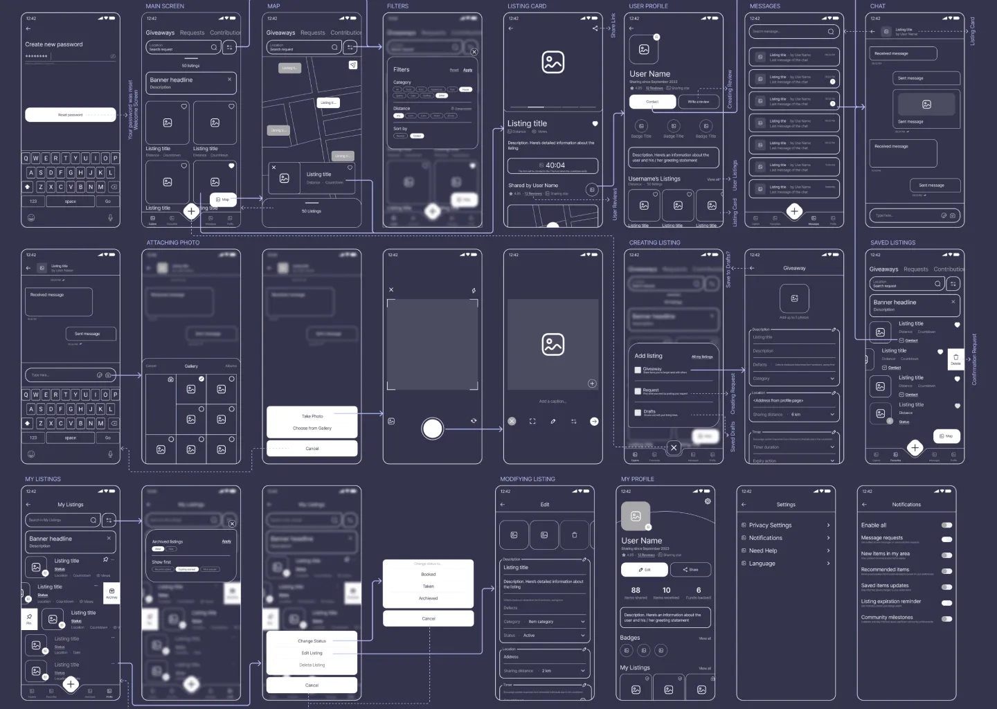
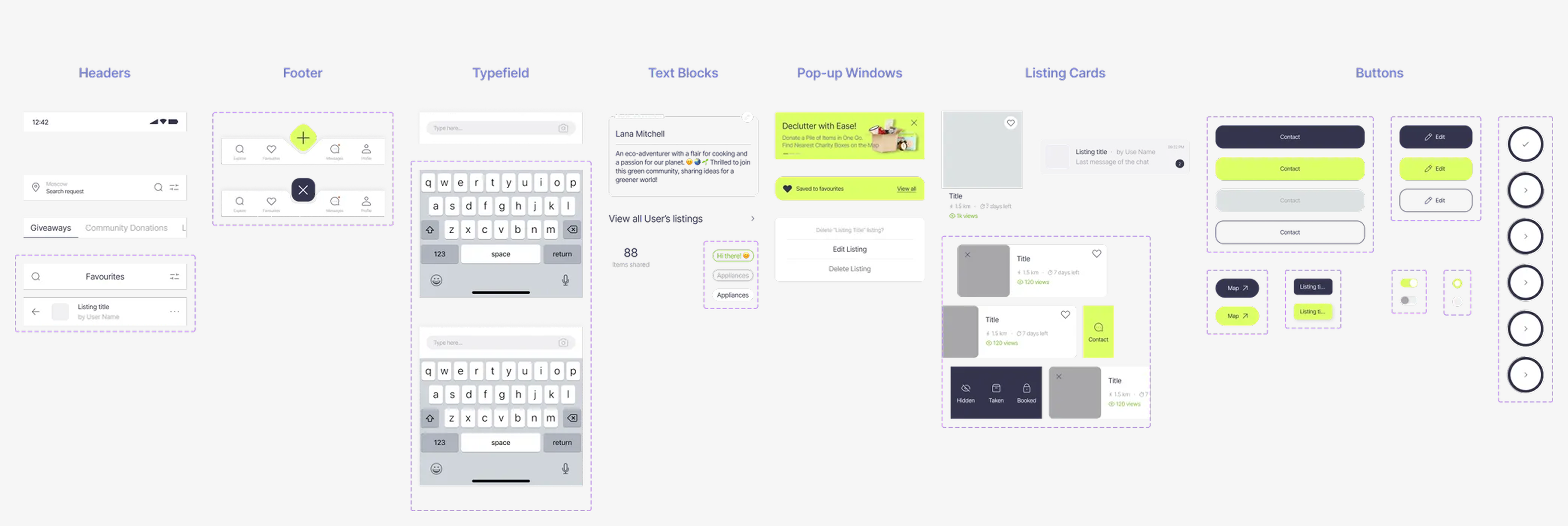
Mid-fi Wireframes
I designed wireframes of the main user scenarios, based on the established Information Architecture and users' pain points that I had identified earlier, along with the solutions I had brainstormed. I put together the layout and functions, ensuring they fit snugly and create a seamless user experience.
High-Fidelity Prototypes
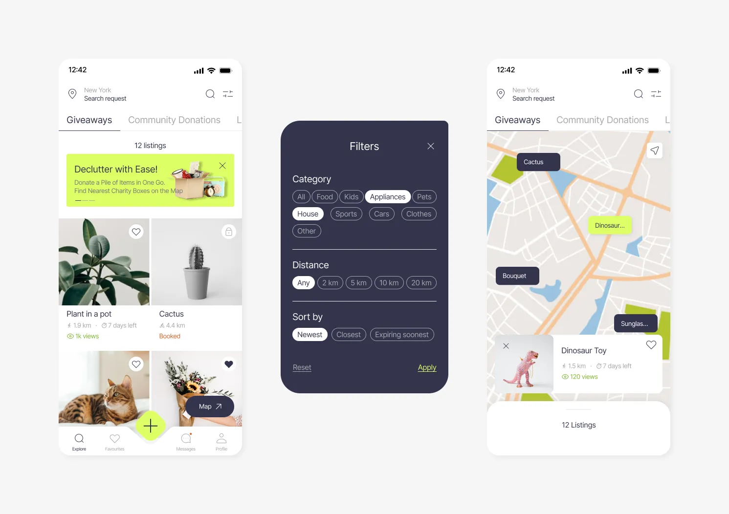
→Main Page
- Giveaways - Listings from users
- Community Donations - List of Charity Organisations & Funds with their requests
- Local Services - Charity Boxes / Recycling Stations / Restaurant giveaways etc.
- # of Views - to motivate people get items faster
- Filters for convenient search
- Map for detecting listings nearby
→Listing Card
- Timer to encourage quicker responses
- Link to Share and spread the word about the app
- Pop-up Prompts
- Option to view Other Listings of user and pick up several items at once
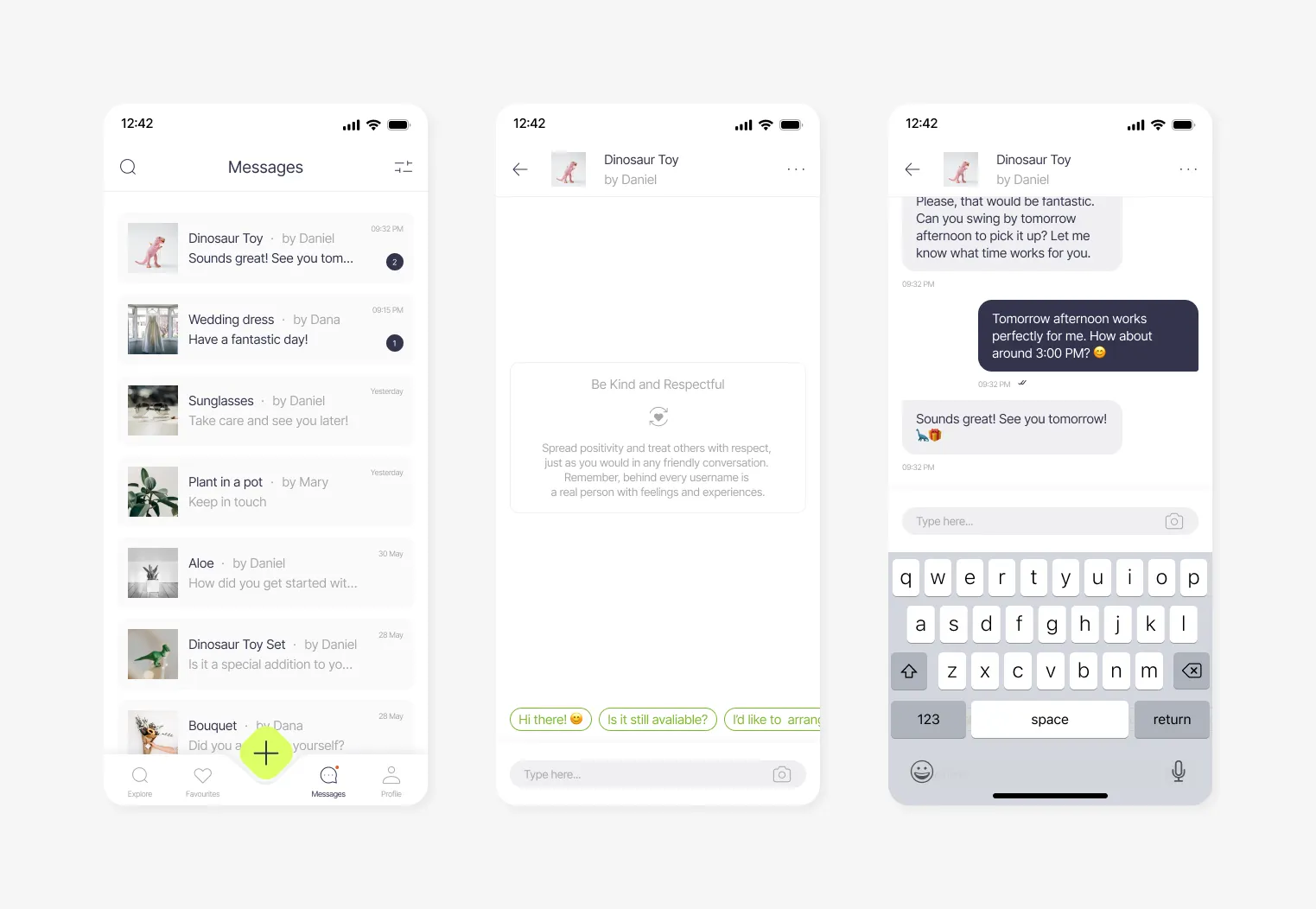
→Messages
- Community Policy Reminder enhancing positive communication
- Inbuilt Review / Report / Status Changing features in the chat
- Prewritten Messages to make quicker responses to multiple users and hit right to the point
→Your Profile
- Wishlist section on your Profile Page for better matching based on user's preferences
- Share Button to invite friends
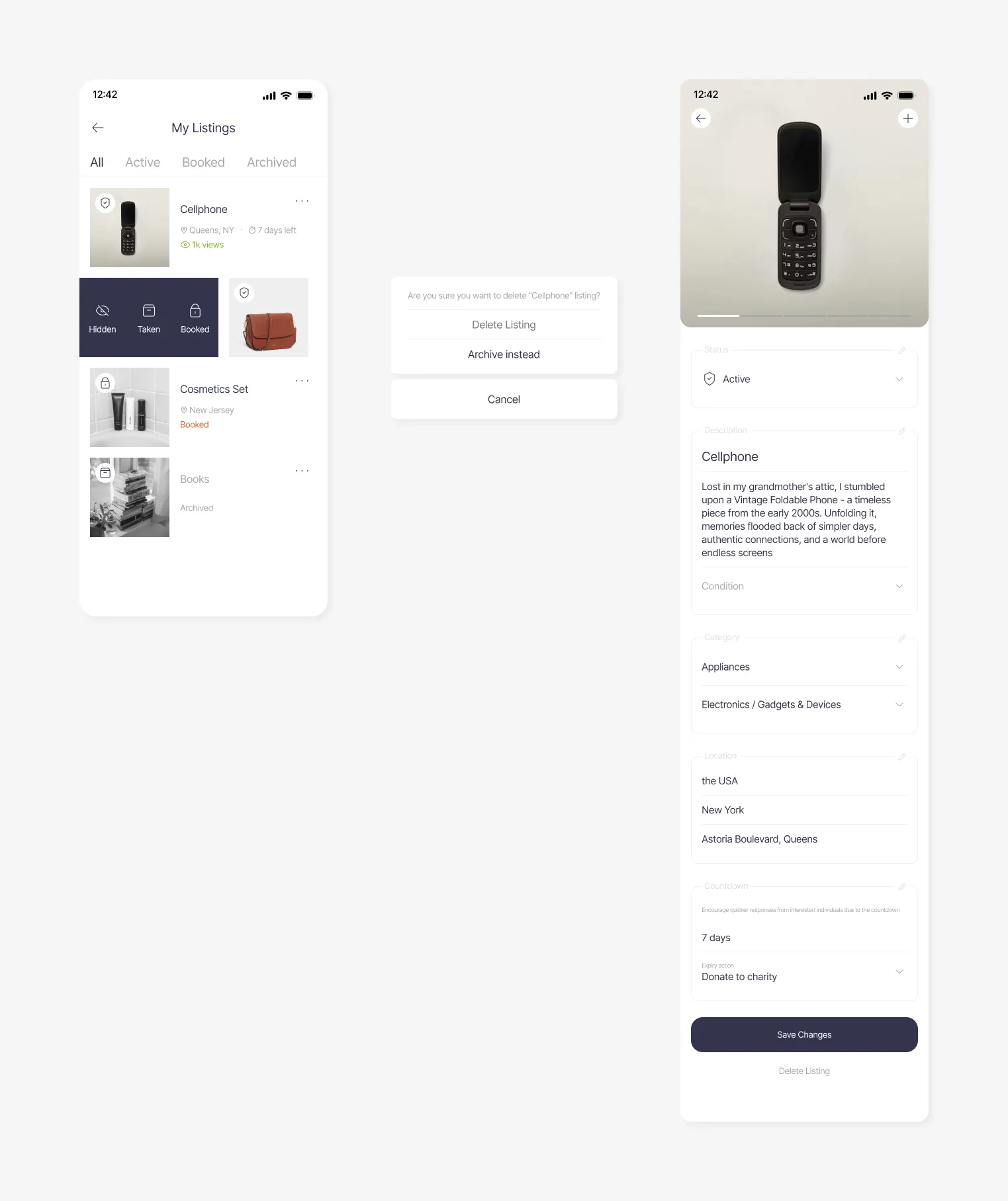
→Your Listings
- Changing Status on swipe
- Prefilled content based on AI Image Recognition and profile information (e.g. location)
- 'Condition' Selective Input
→Creating Listing
- Animated 'Add' button
- Saving listings to Drafts
→Favourites
- Contact button on swipe
Usability Testing Scenarios
- Searching for a Suitable Listing — Users will be presented with the task of searching for a needed item nearby using various filters. They should also be able to save listings as favourites for later reference and view listings on a map to estimate proximity effectively.
- Evaluating Listing Details and User Reliability — Participants will be asked to review the details of a selected listing and assess the reliability of the person offering the item. They should have the ability to contact the giver and report any concerns they might have.
- Interacting with Other Users through Messaging — Users will test the messaging functionality by checking for any new messages received from other users. They'll also be prompted to engage in a conversation to arrange a pickup for an item of interest.
- Managing Saved Listings — Participants will navigate through their list of saved listings, make modifications to the list, and then proceed to arrange a pickup time for one of the items.
- Uploading a Listing — Users will be instructed to create a new listing to give away an item. This scenario will assess their ability to provide the necessary information and images for the listing.
- Modifying Your Own Listings — Participants will access the 'My Listings' section and modify one of their existing listings. They should be able to change the status of the item as well.
- Adjusting Settings and Personal Information — Users will explore the app's settings, specifically focusing on changing privacy settings, configuring notification alerts, and updating personal details.
Three people were recruited for the usability test. During the tasks, they were asked to verbalize their thoughts and actions as they completed them. The outcomes were consistently successful, with all scenarios being effectively executed. However, a few minor areas for potential improvement in user experience were identified during the process.
A list of potential feature improvements can be considered to elevate the user experience in future iterations:
- Incorporate animations or popup windows to indicate that listing cards in Favourites and My Listings sections can be swiped for easier interaction.
- Provide clearer explanations of the categories to enhance user understanding.
- Highlight the map function to emphasize its importance in estimating proximity and pickup points.
- Improve the visibility of the text associated with the timer feature to make its function more evident.